| Videos | ? Latest |
|
? Feature | ? Sports | ? Your Videos |
Starbucks debuts new logo in China

|
|
 |
|
|
Starbucks' new logo |
The logo used between 1992 to March. 8, 2011 |
|
 |
 |
|
|
The logo used between 1987 to 1992. |
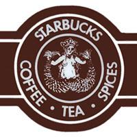
The logo used between 1971 to 1987 |
Late last year, Starbucks announced it was opening its first ever coffee bean farm and processing facility in China. China-specific products are also being designed to suit the tastes of consumers in the world's second largest economy. Some customers see the new logo as a step in the right direction.
Zhang Xin, Private Business Owner said "Without the words that used to be on it, it gives a more international feeling. There's no need to emphasize on the words, it just needs to keep up its culture and quality of coffee. As long as the logo is recognisable from afar - just like the McDonalds' big M logo, and I think that's good enough."
After slashing costs and closing stores in 2008 and 2009, the world's top coffee chain was able to return to growth. Now, on the occasion of its 40th anniversary, the Starbucks rebrand marks a new direction for the company. The thinking is that a logo that makes no mention of coffee will open up new possibilites. It certainly is a world away from the Seattle fish market where Starbucks first started brewing beans all those years ago.
 0
0 


